THE BRIEF
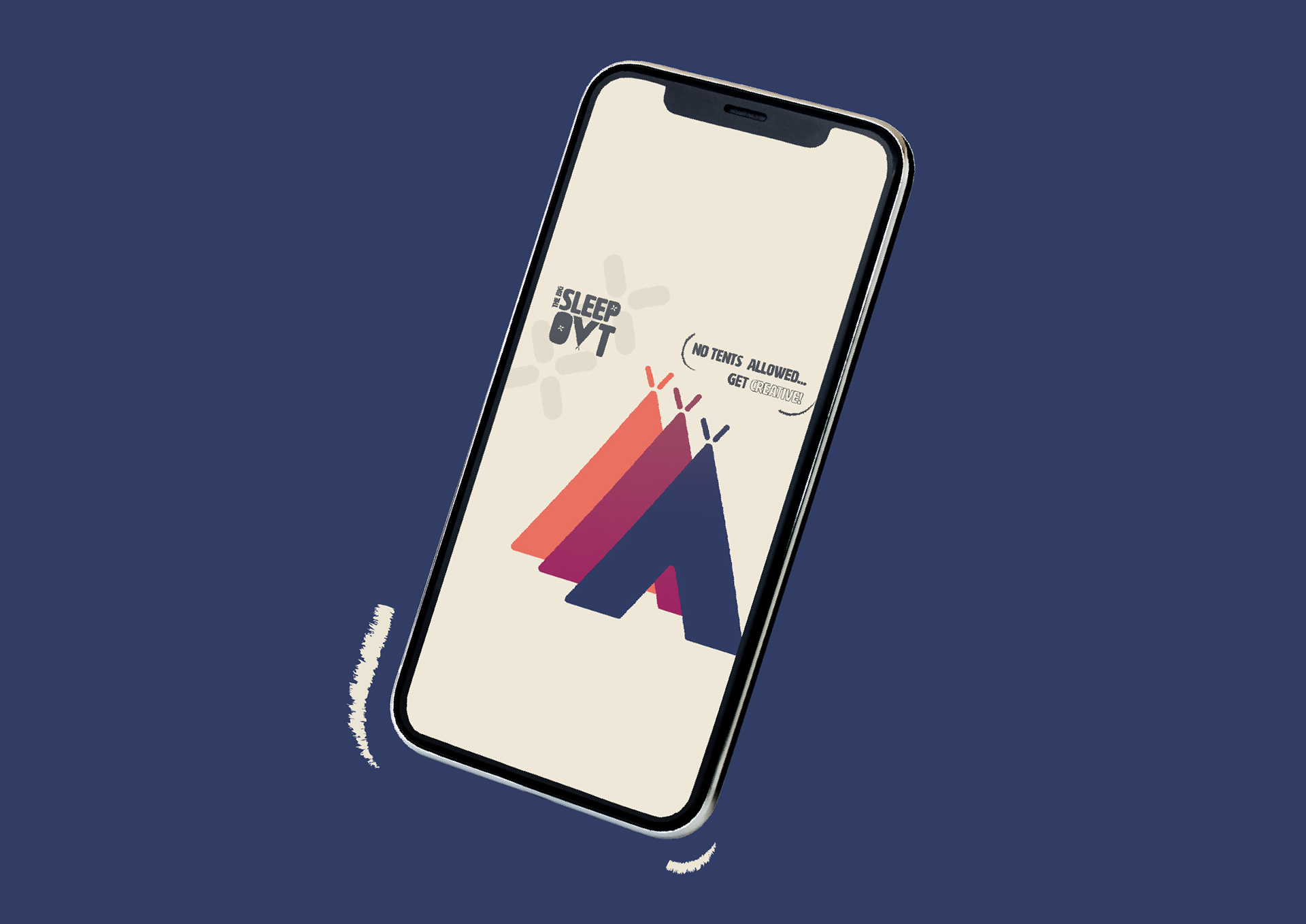
Hope Charity were seeking a fresh new look for their largest annual fundraising event ‘The Big Sleep Out’, as well as additional social media assets for Hope’s key online platforms. The branding for the Big Sleep Out needed to compliment the current Hope branding colours and style, with an aim of attracting a wider audience to participate with the fundraising event.
THE CONCEPT
A vibrant and bold colour palette was chosen to compliment the original hope purple. A key aspect to the design approach was to appeal to a younger audience with the aim of attracting new people to Hope. The Big Sleep Out branding design is minimal and abstract, utilising simple shapes and incorporating the theme of sleeping outside.
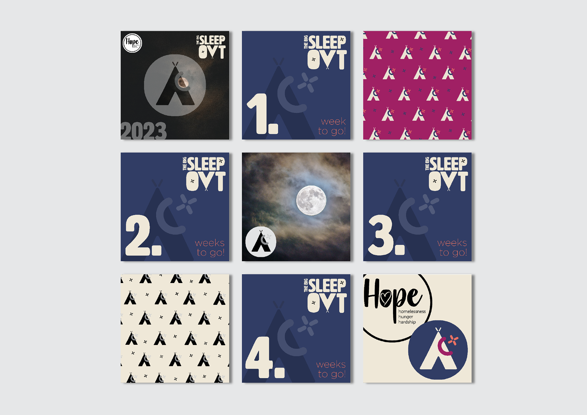
THE BIG SLEEP OUT BRANDING
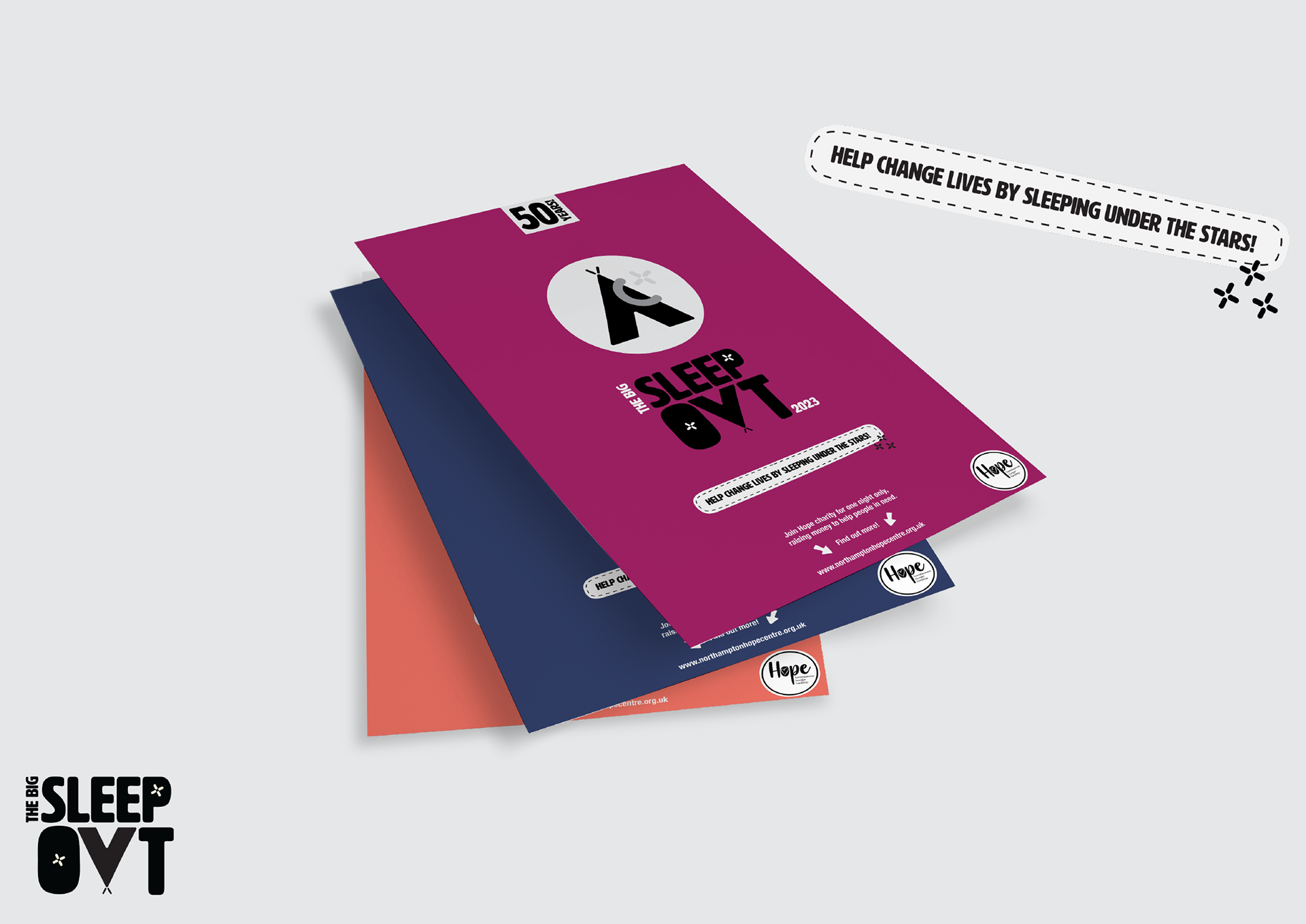
PROMOTIONAL FLYERS
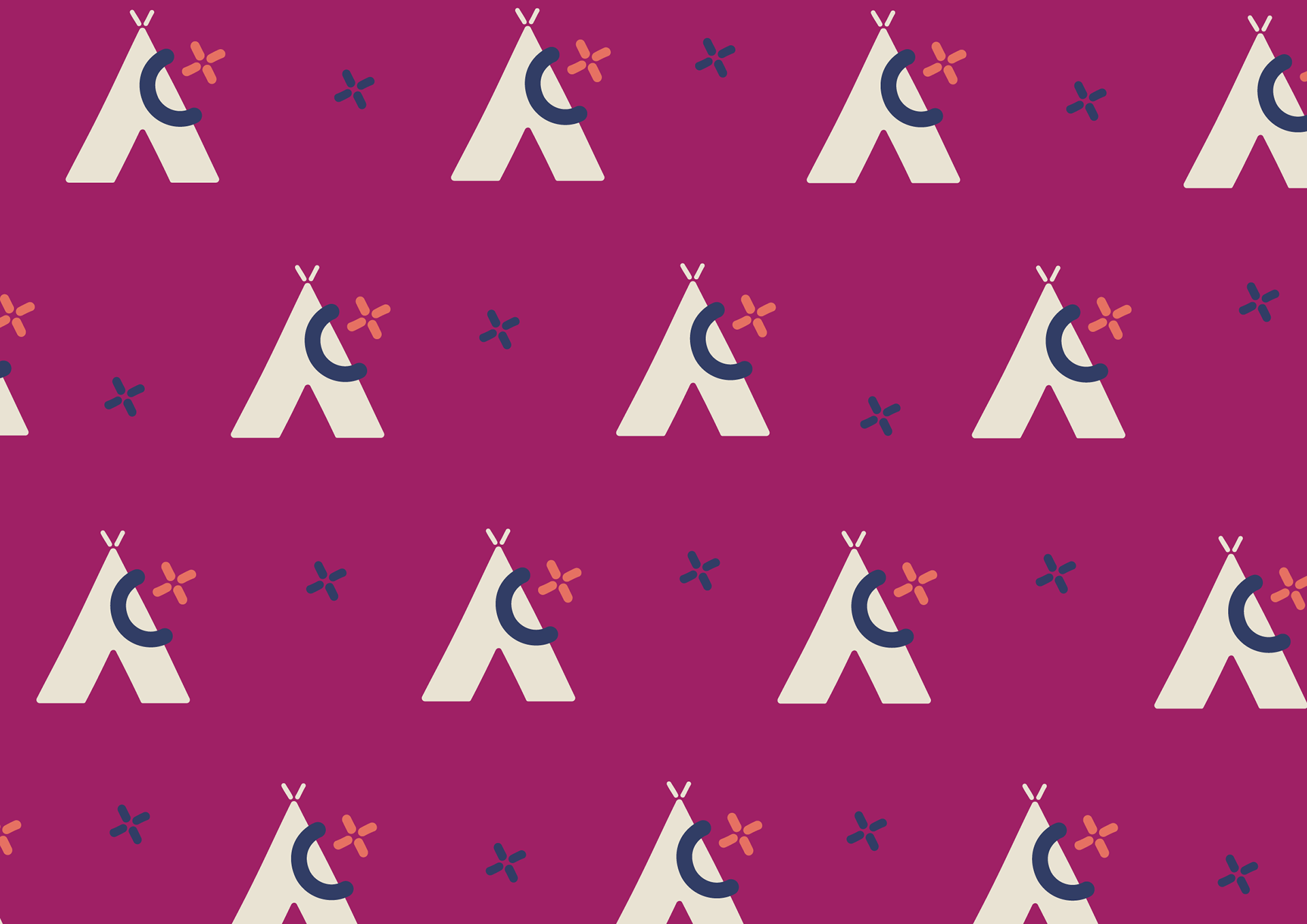
VISUAL IDENTITY: PALETTE | LOGOS | BRAND PATTERN

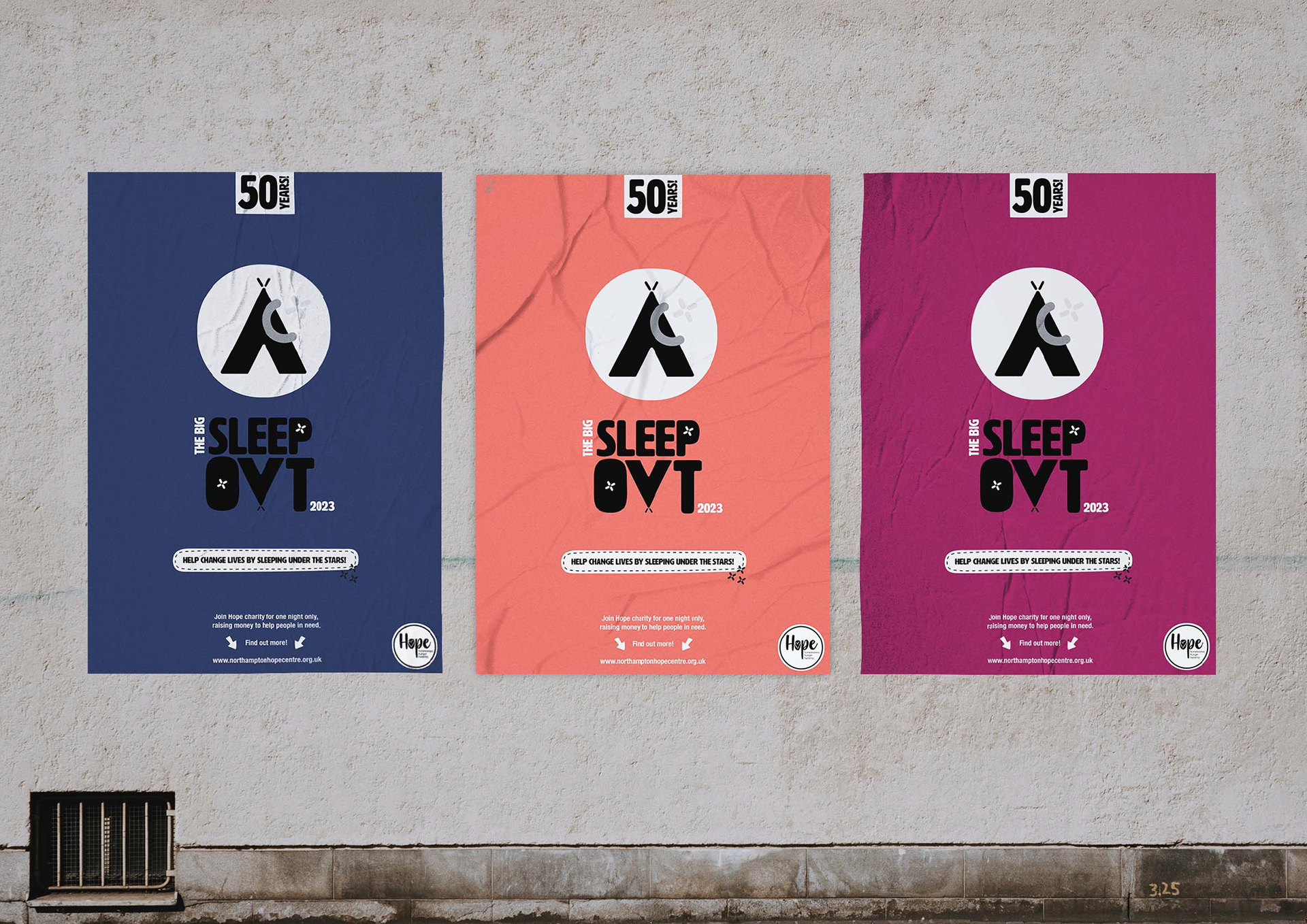
SLEEP OUT POSTER DESIGNS
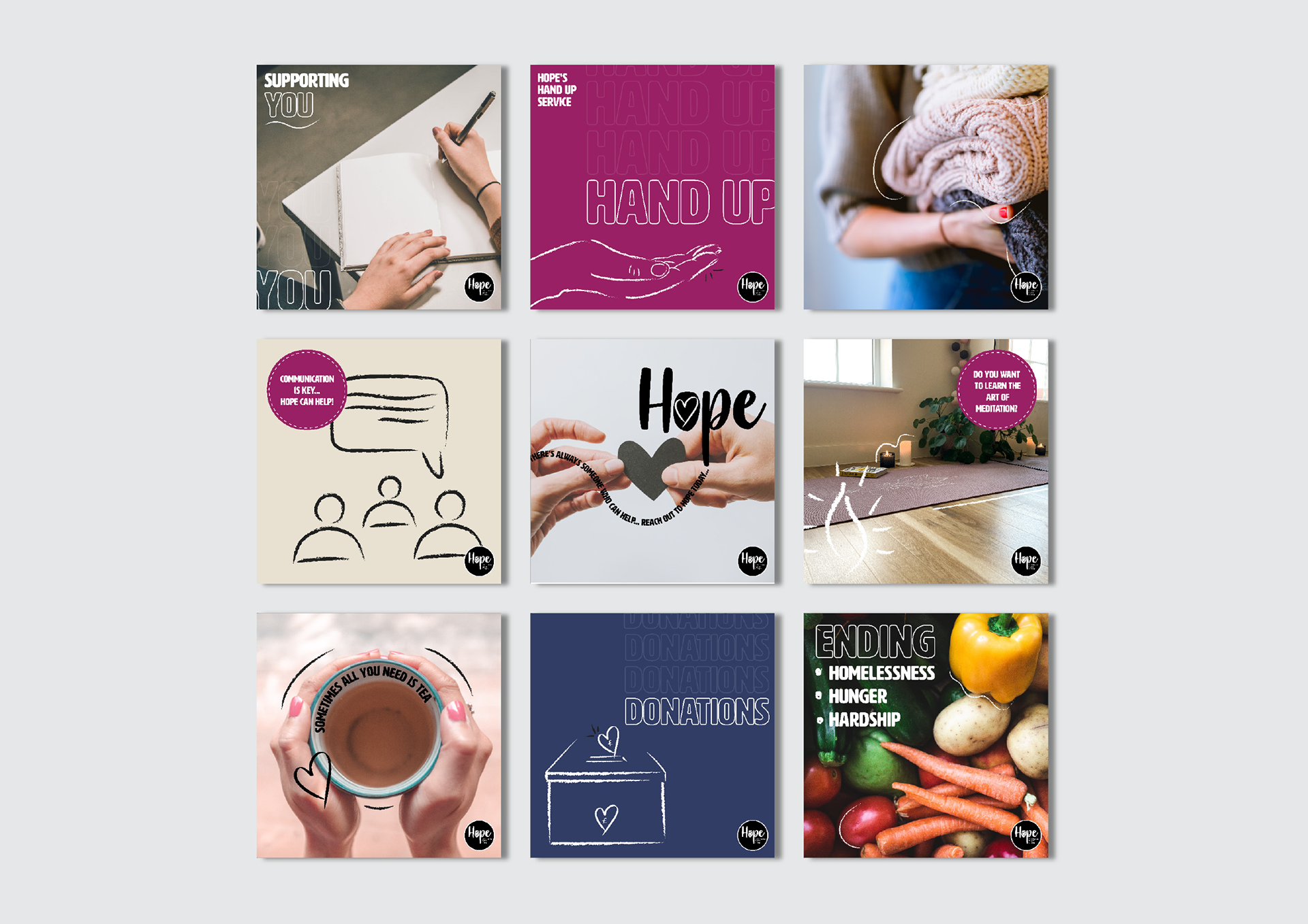
SOCIAL POSTS