
THE BRIEF
Quagga Design were seeking an innovative wayfinding sign family for CitizenM which encapsulates their modern and unique brand identity. The CitizenM brand aims to inspire a new generation of modern travellers in key cities by offering luxury accommodation at affordable prices. Deliverables for the project included welcome signs, totems and additional interior signage.
THE APPROACH
Before jumping into the design phase, I spent time looking into the area where the hotel is situated. My findings concluded that the hotel is within the business district of Paris, so a particularly busy and bustling area. Through further exploration, I found a variety of interesting artwork and sculptures located around La Defense.
Given the fact that the citizenM brand prides itself on supporting local artists, I started to think about how the design of the signage family could embrace the idea of bringing the surrounding area inside the hotel, incorporating these pieces of artwork into the signage to create a unique and bold design.
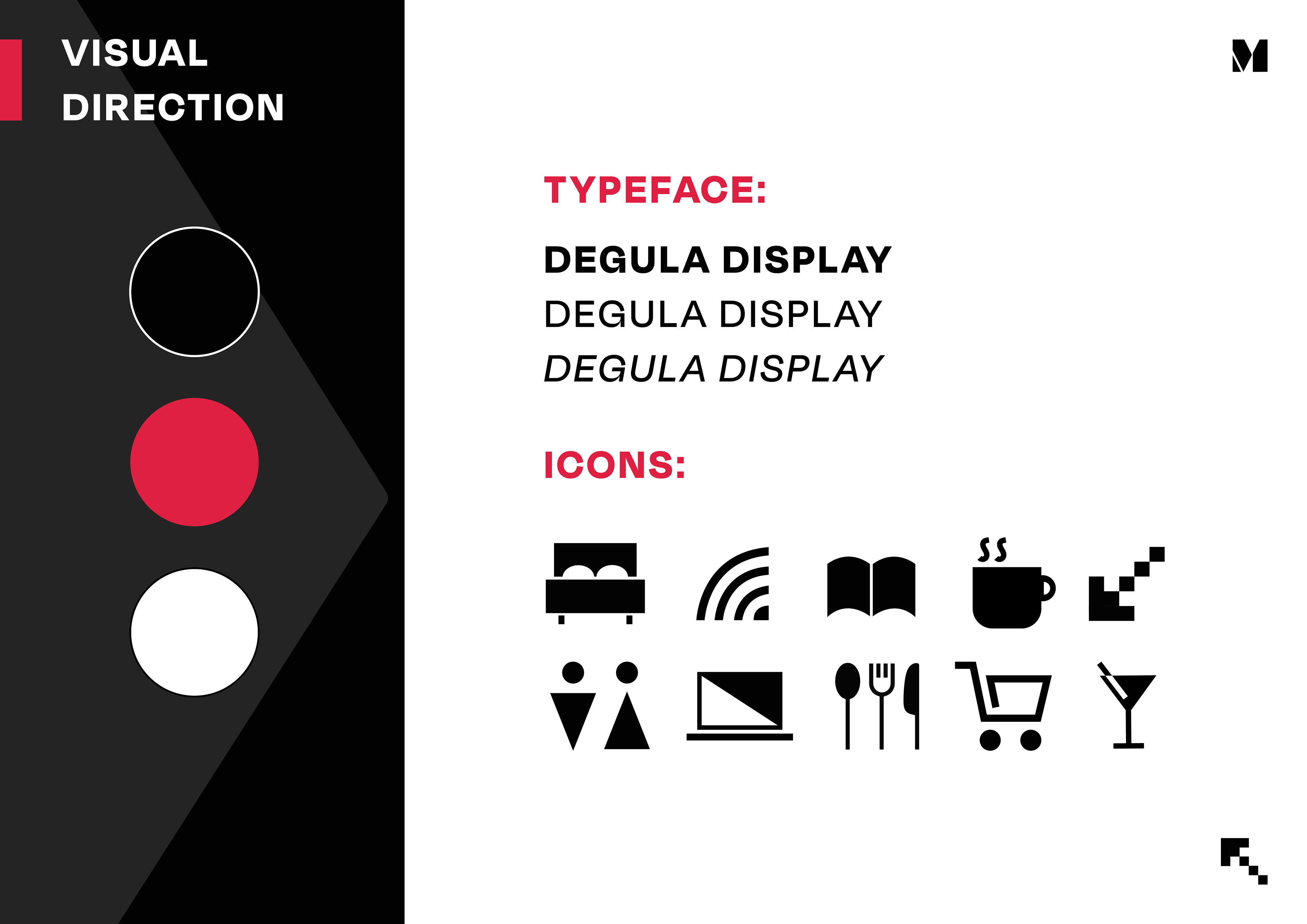
I chose to keep the colour palette consistent with the CitizenM Branding to allow the textures to become the focus. A modern sans serif typeface runs throughout the signage and a range of unique geometric and versatile icons have been created for functional purposes and to boost the overall branding.
DEVELOPMENT OVERVIEW
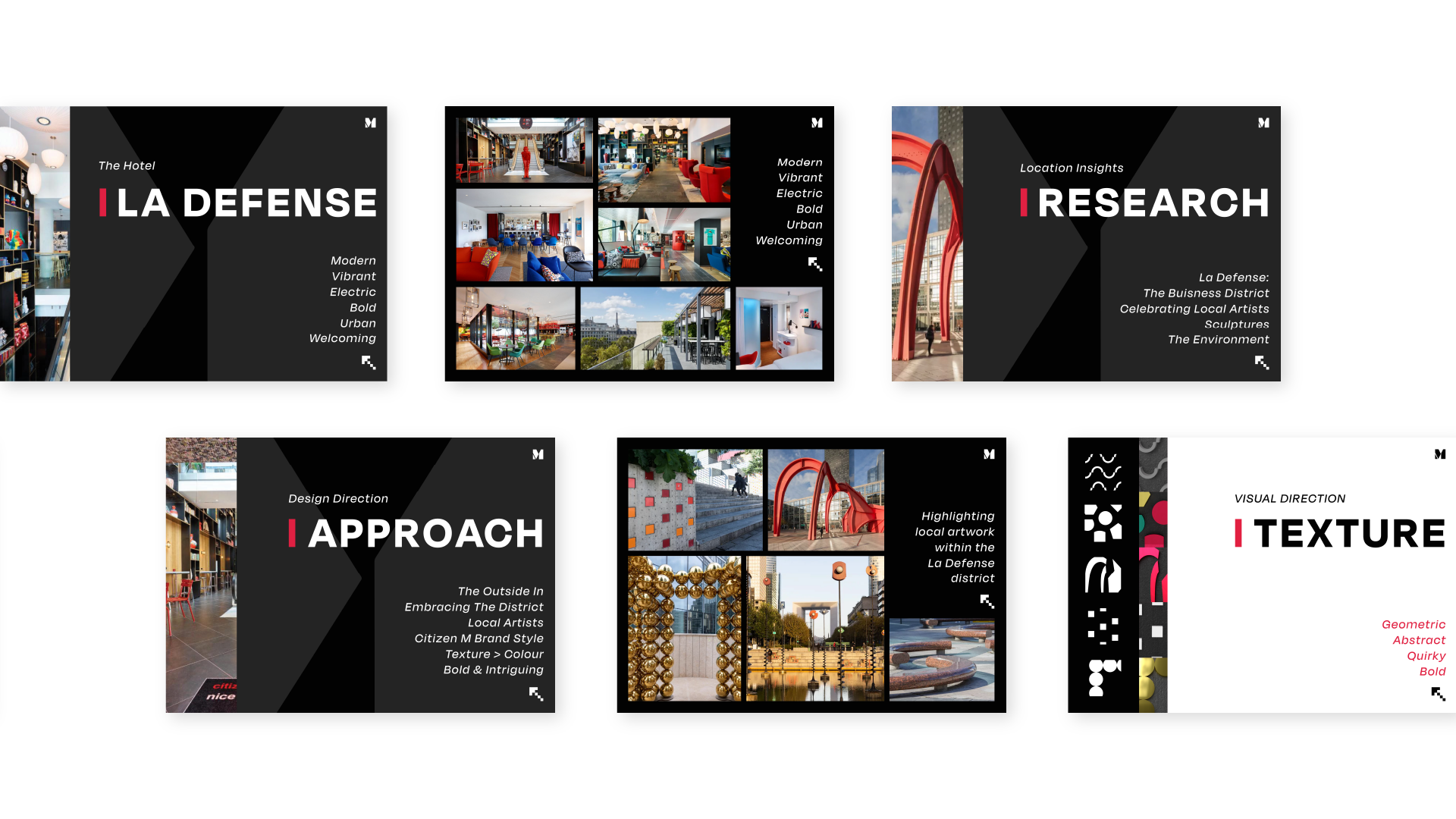
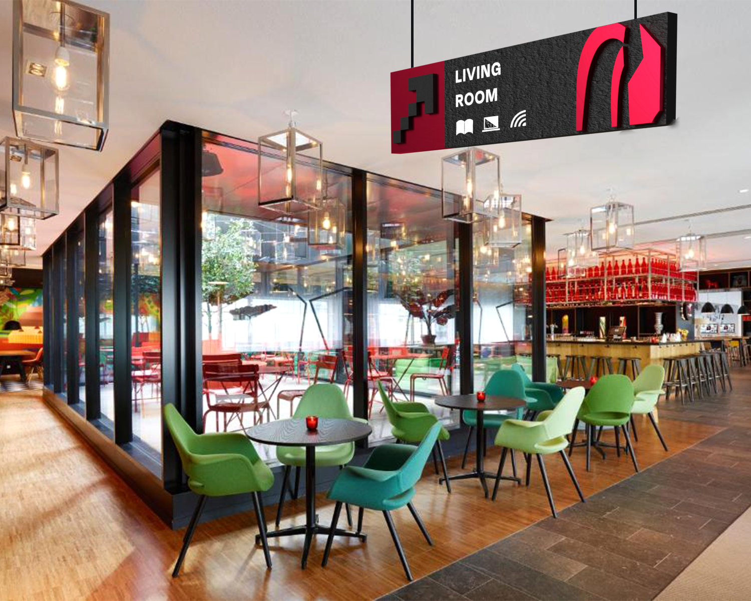
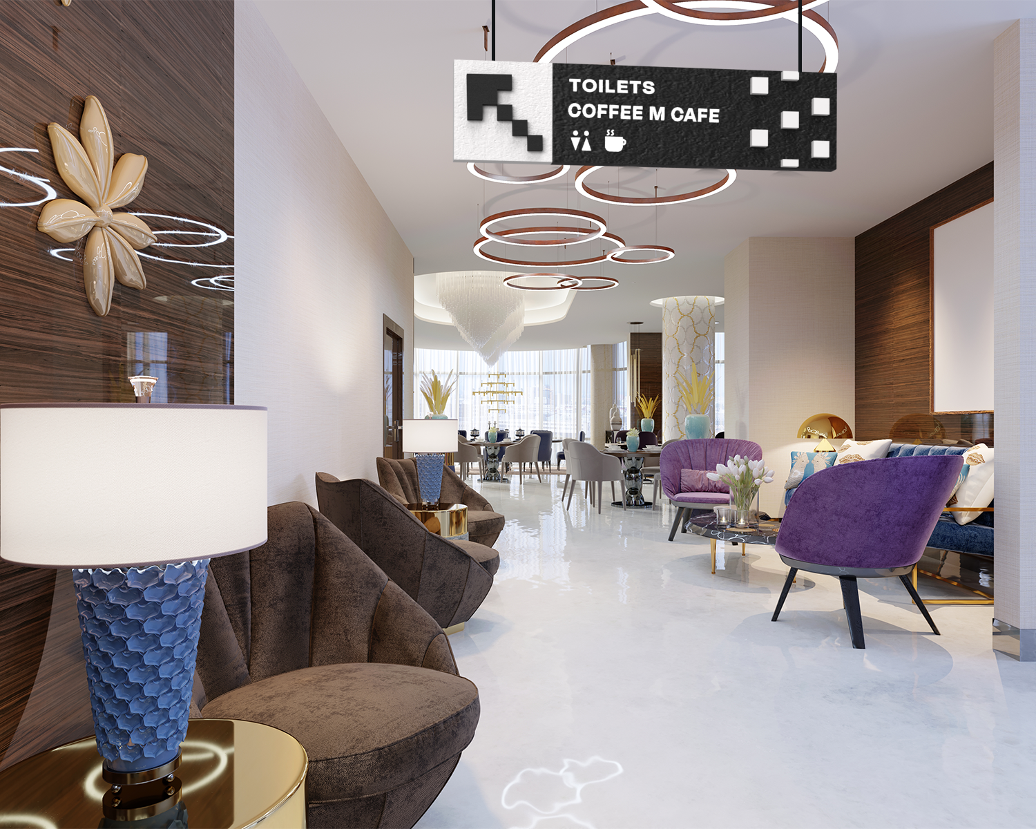
Instead of focusing on colour, the design style celebrates texture and geometric shapes, creating a stronger link to the original artwork and embracing the quirky interior of the hotel.
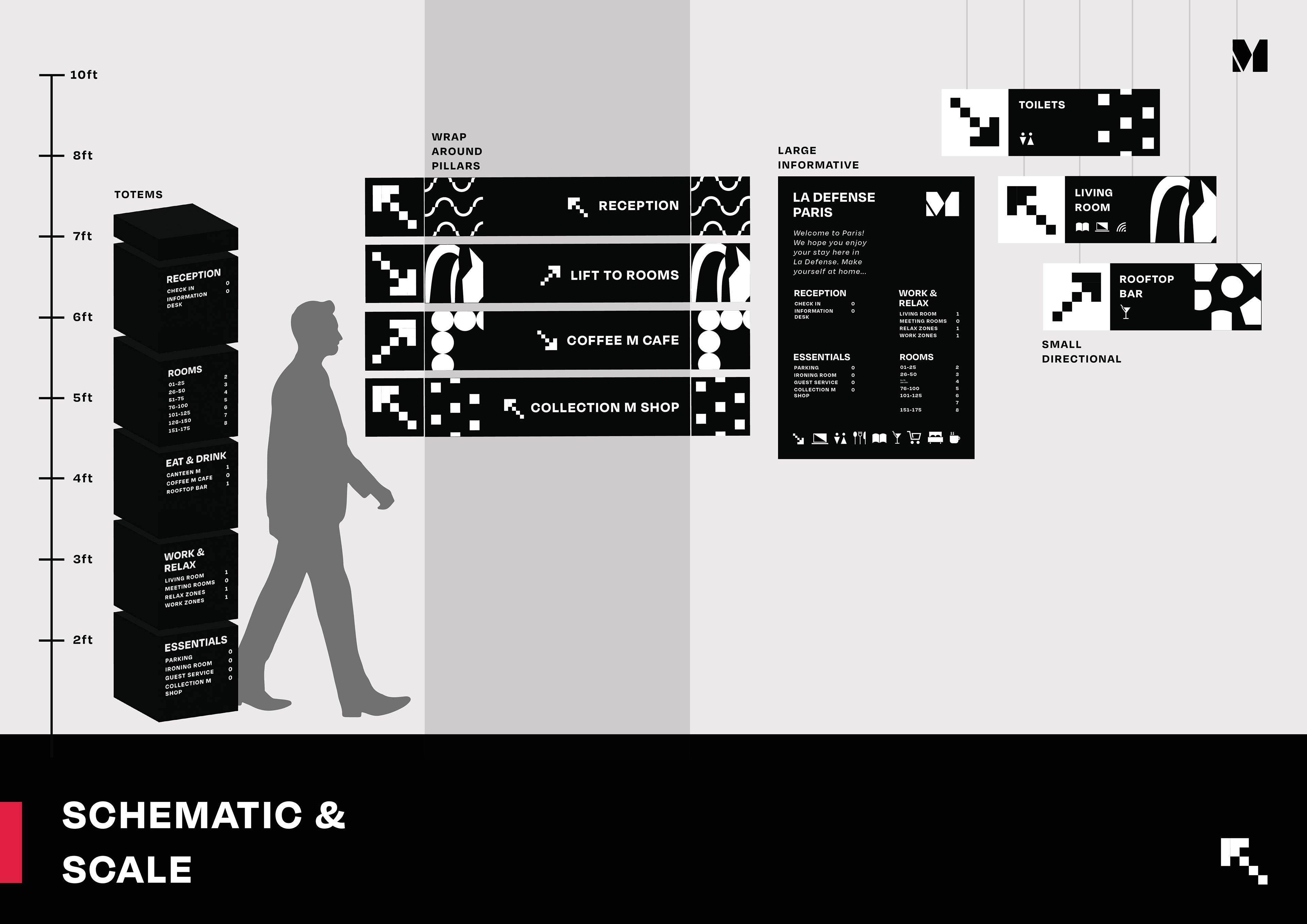
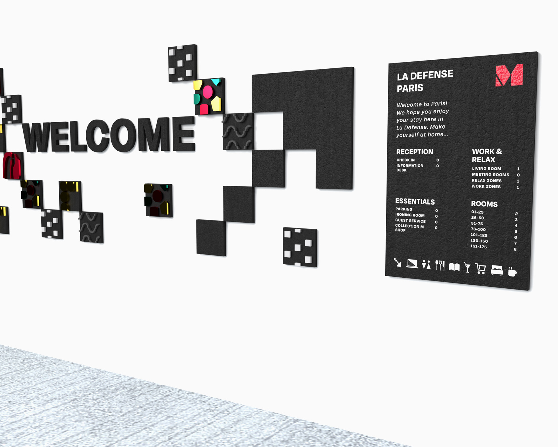
Large scale welcome signs will be placed within the entrance of the hotel and embrace the concrete effect textured tiles within the design, creating a bold and striking welcome. The written signage boards have been kept minimal, allowing the shapes and textured tiles to shine through and become the focus of the designs.
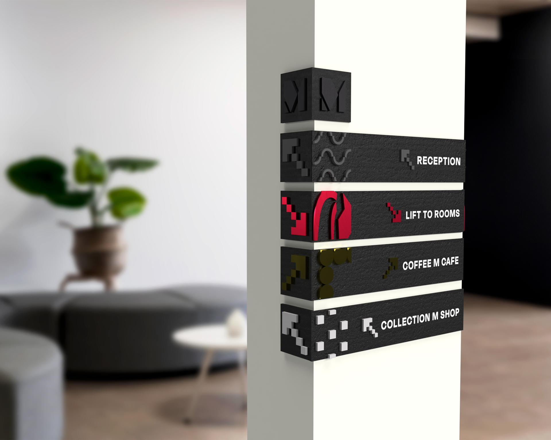
Wrap around signage will make use of architectural elements of the building, allowing the signage to work seamlessly within the hotel space. The design of these has been kept consistent with the totem designs, ensuring a strong identity is maintained across the family.
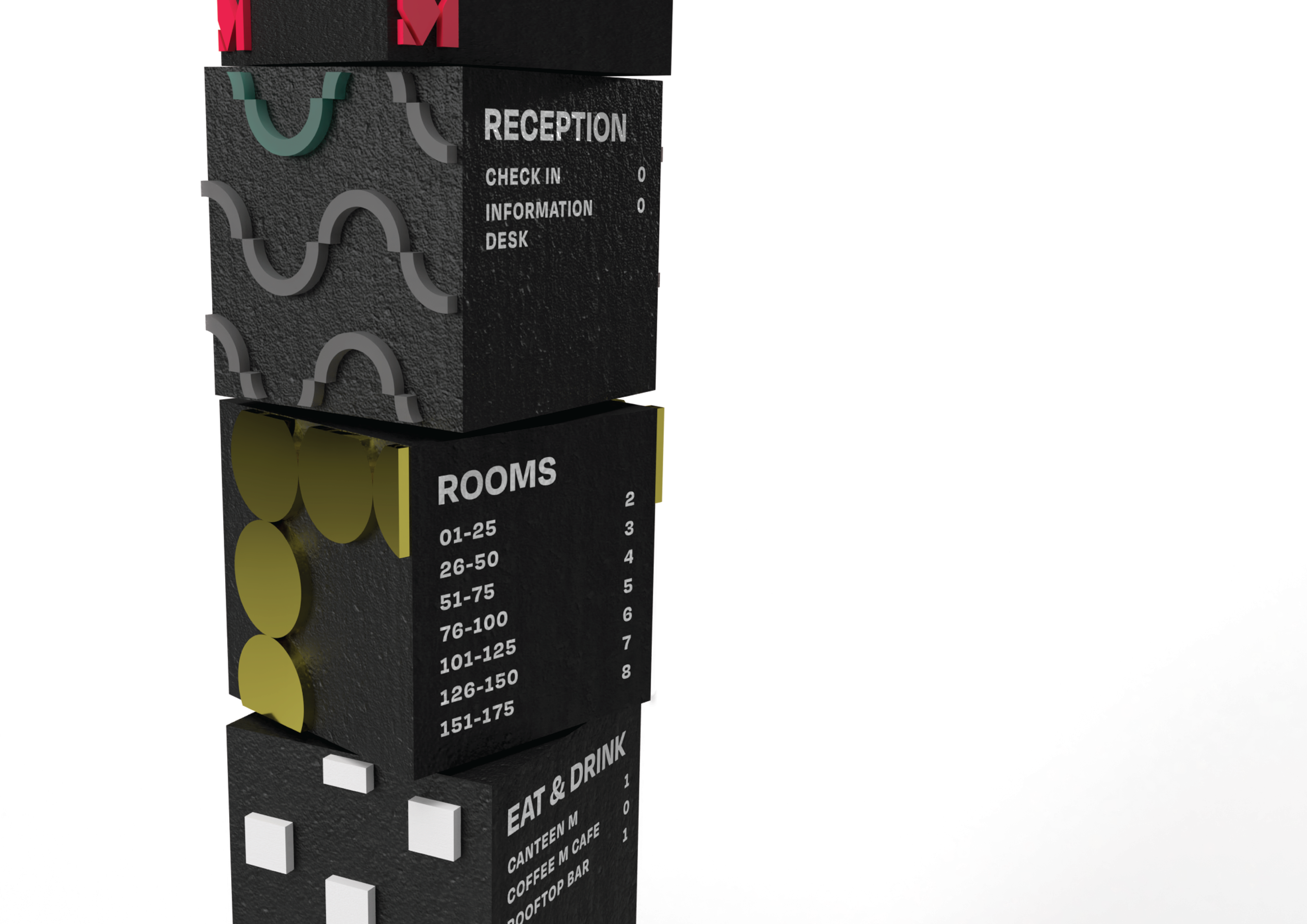
The totem designs form a key part of the signage family and are made up of large concrete effect blocks with textured patterns adding an element of interest. These totems will be placed in prominent locations around the hotel and include an overview of key areas.
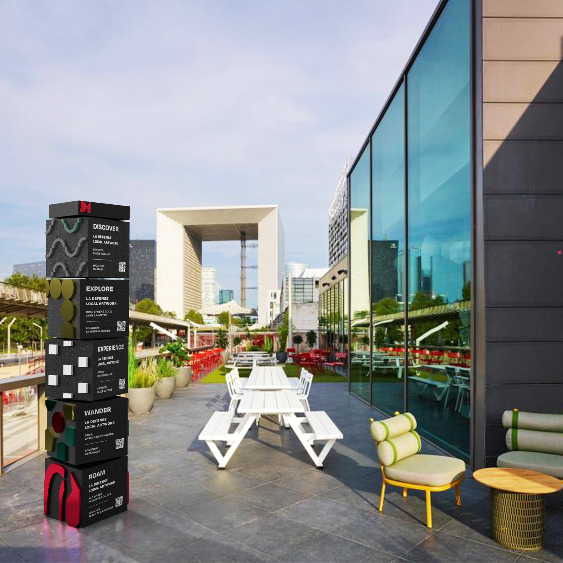
The totems include further information for guests to find out about the local artwork within the area through a QR code link, encouraging exploration of the hotels location.
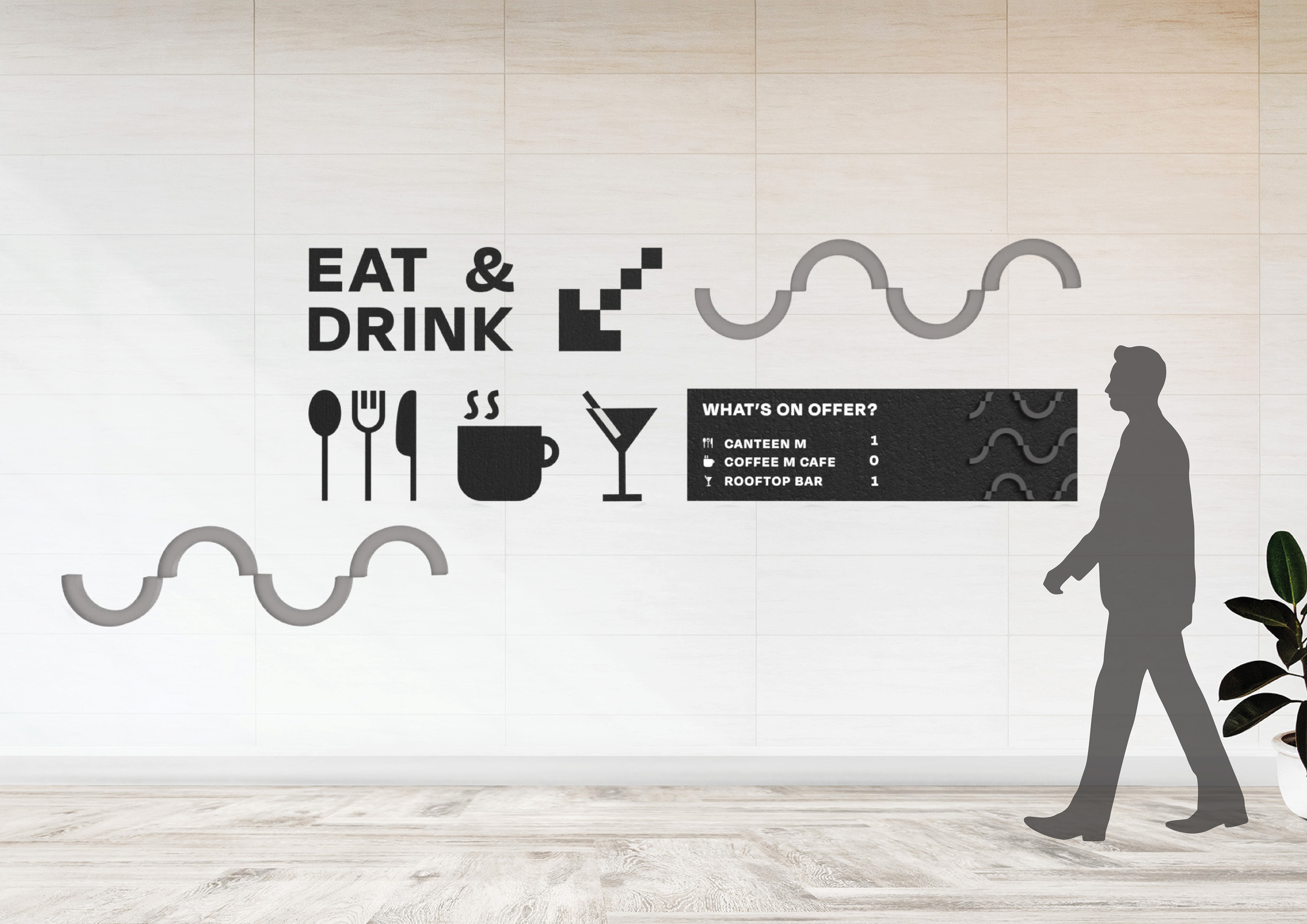
Large scale wall graphics link back to the welcome sign and also utilise the abstract patterns and icons in a bold and clear way. The modern aspect of the hotel lends itself particularly well to this kind of signage and offers the opportunity to reinforce the hotel’s brand identity and design aesthetic.